 Have you ever looked at how you look at things? If you did, you’d notice consistent visual patterns that have a lot to do with what you end up absorbing. Well, what if your website layout was built around these natural human tendencies — rather than just the creative approach of the designer? The likely answer is that your web visitor would tend to notice more, become more engaged, and stick around longer.
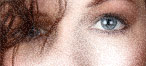
That’s reason in itself to take a closer look at your readers’ eyes, and the way they approach, say, your site’s home page. Below are five different visual dynamics that affect your prospective buyer’s experience … plus some thoughts on what to do to keep their focus where you want it.
1. The Scan and Focus Cycle
You’re probably aware that people don’t generally jump in and read every word on a web page. They start by visually ‘scanning’ it, their eyes darting around until some element catches their attention. Then they focus on that element, until they’ve absorbed enough. At that point they go back to ‘scan mode.’ Then ‘focus mode.’ Over and over. It’s a pattern we use for more than just web pages; for example, pay attention to your attention the next time you walk into a retail store, and you’ll see that sequence play out repeatedly.
What to do about it: Keep in mind that a large chunk of plain text is intimidating to your visitor’s scanning eye, no matter how important you think it is. So break up your home page content into sequential bite size pieces, each between 25 and 100 words. Each of those sections should have its own headline, between 5 and 10 words. Now as folks do their scan-and-focus thing, they’re taking in a nice comfortable eyeful at each step.
2. Know the Eye’s Landing Zone
When your reader’s eye lands on your home page, it’s going to do so at upper left; not all the way in the corner, but a couple of inches in from the top and left edge. Then, left to its own devices, their eye will have a tendency to travel down and to the right.
What to do about it: First, greet the eye at its landing spot, by placing something there you really, really want them to see. Then add the next thing you’d like them to notice immediately below or to the right of it. Put your best bits & pieces in the eye’s path, rather than, say, at upper right or at lower left, where they can and will be easily missed.
3. We Notice What’s Most Noticeable
All other things being equal, what will your visitor’s eye be drawn to first? Whatever is most visually prominent. A big bold headline will trump a smaller headline. A big colorful image will trump a small headshot. People will tend to jump from element to element, based on decreasing order of visual prominence.
What to do about it: Decide what your most important message is, and make that the largest. No brainer, right? Then prioritize your messages in terms of decreasing font size. Now, notice how this principle interacts with the last one. If a large-font headline is first, and a smaller sub-head follows it, the eye is happy because it knows exactly how to proceed. But if the smaller line is first, the eye vacillates for a moment, caught in a brief conflict. You’d be surprised: tiny disconnects like this are what make the ‘Back’ button so darn popular among web searchers.
4. Don’t Hide In the Corners
Although your visitor can ‘see’ everything in your website layout, it doesn’t mean they’re actually absorbing it all equally. Elements at the edges of the page tend to be ignored, since a page’s ‘center of gravity’ tends to be toward the middle.
What to do about it: Try not to begin a piece of text all the way at the left edge if you can help it. To a scanning eye marching down and to the right, asking it to make an unnatural u-turn to travel over to the left edge is actually asking a lot. A lot of important stuff gets missed that way. And have you wondered why visitors aren’t clicking on the tiny text links in your navigation menu, way up there in the top right corner? Now you know.
5. Let’s Look at Pictures
Our minds process visual information much quicker than written info. Which means our eyeballs tend to be drawn to web images before they move on to the text.
What to do about it: Unless your site is showcasing food, fashion or furniture, it’s generally the words on your site that are doing the real selling, and the pictures are pretty much supplementary. Images initially catch our eye, but we don’t spend nearly as much time focused on them as we do on the text. So, when you have a super important headline, pair it with a compelling visual as an ‘eyecatcher’ to draw the reader’s attention. Funny thing is, the fact of having an image there is probably more important than what the image actually shows.
So you’re probably asking at this point, don’t these various dynamics overlap? Well, yes, they do. Along with any number of other visual factors on the page, they interact to create a website experience that perhaps you can’t completely control. But by keeping these factors in mind, you have a much better chance of drawing your buyers in, as you engage them, persuade them, and sell whatever it is you have to sell.
And that’s something your competitors probably aren’t doing with their own website layouts. Because they don’t know what you now know about how the human eye works.
Would your website be bringing you more business if the layout and messages were designed more with the reader in mind? I’ll be glad to take a look and make some recommendations if you’d like. A Website Marketing Audit is a careful review of your website, with a report on how to draw buyers closer, as well as hidden factors that might be pushing them away. You never know what I might uncover. Learn more.
–Tom